Tips for Choosing Calm Colors to Create a Peaceful Home
Creating a peaceful and relaxing environment in your home often begins with the colors you choose for your walls and decor. Calm colors can reduce stress, promote tranquility, and make your living space feel welcoming and restful. Whether you’re redecorating a single room or refreshing your entire home, selecting the right hues plays a crucial role in setting the mood. Here are some helpful tips to guide you in choosing calm colors that bring harmony and serenity to your space.
Understanding What Makes Colors Calm
Calm colors generally have qualities that soothe the eyes and mind. They typically include muted tones, pastels, and colors found in nature. Think soft blues, gentle greens, light grays, and subtle beige or blush tones. These colors are often low in saturation and brightness, which helps minimize visual stimulation.
Why Calm Colors Matter
– Promote relaxation: Calming colors can reduce anxiety and create a restful atmosphere.
– Improve focus: Soft hues can help concentration and reduce distractions.
– Enhance space: Light, muted colors can make small rooms feel more open.
– Create harmony: These colors coordinate well and provide a cohesive look.
Tips for Choosing Calm Colors for Your Home
1. Consider the Room’s Purpose
Each room serves a different function, so your color choice should support that:
– Bedroom: Opt for tranquil blues, soft greens, or gentle lavenders to promote restful sleep.
– Living Room: Neutral tones like warm grays or creamy beiges create an inviting and cozy atmosphere.
– Bathroom: Light blues or seafoam greens evoke a clean, refreshing feel.
– Home Office: Muted earth tones or pale blues can enhance focus and calmness.
2. Test Colors in Natural Light
Colors can look very different depending on lighting. Always test paint samples on your walls and observe them in daylight and at night. This helps you choose a shade that remains calm and consistent throughout the day.
3. Use a Color Palette
Choose a main color and complement it with two to three accent colors. Sticking to a soft color palette helps maintain a soothing environment:
– Monochromatic: Different shades of one color create depth without disruption.
– Analogous: Colors next to each other on the color wheel (like blue and green) blend naturally.
– Neutral base: Pair calm colors with whites, creams, or soft grays.
4. Consider Texture and Finish
The finish of your paint can affect how calm a color feels:
– Matte or eggshell finishes reflect less light and feel softer.
– Glossy finishes can be more stimulating and better suited for accents.
Adding texture with fabrics, rugs, or wall treatments in calm colors further enhances the tranquil vibe.
5. Balance Warm and Cool Tones
Cool colors, like blues and greens, are traditionally calming. However, warm tones such as soft peach or muted pink can also feel soothing when used thoughtfully. A balance between warm and cool tones prevents the space from feeling too cold or too dull.
6. Use Color Psychology as a Guide
While personal preference is key, understanding basic color psychology can help you select calming colors that fit your mood:
– Blue: Promotes peace and relaxation.
– Green: Symbolizes nature and balance.
– Lavender: Often associated with calm and spirituality.
– Beige or Taupe: Neutral and grounding.
– Soft Gray: Elegant and restful.
7. Don’t Forget Accents and Accessories
If you’re hesitant to paint all walls, introduce calm colors through accessories:
– Cushions, throws, and rugs.
– Artwork and decorative vases.
– Curtains and bed linens.
This also gives flexibility if you want to change the look later.
Practical Examples of Calm Color Combinations
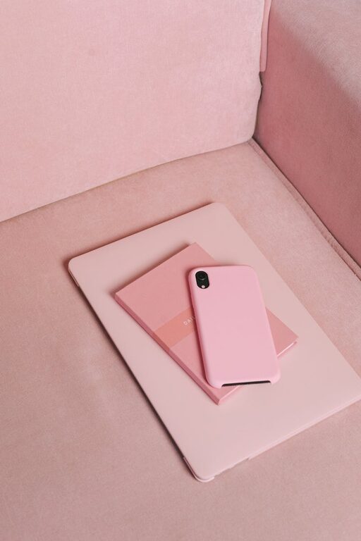
– Soft Blue and Light Gray: Ideal for bedrooms and bathrooms, this combo is soothing and fresh.
– Sage Green and Warm Beige: Brings a natural, earthy feel perfect for living rooms.
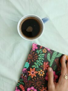
– Lavender and Off-White: A light, gentle pairing that works well in cozy reading nooks.
– Muted Coral and Pale Gray: Adds subtle warmth without overwhelming the senses.
Final Thoughts
Choosing calm colors for your home is about creating an environment that supports your well-being and style. Take your time to explore different shades, test samples under various lighting conditions, and consider the purpose of each space. By combining color psychology with practical application, you can design a home that feels like a peaceful sanctuary.
Remember, even small touches of calm colors can make a big impact on how you feel at home. Whether you paint entire rooms or simply add soft accents, these colors invite relaxation and comfort every day. Happy decorating!